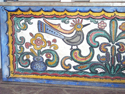
Many times we
get requests to illustrate the certificate with a picture of
the wedding's location. This couple wanted to show the art work
that decorated the inside of the chapel where they held their
ceremony. Below are two of the photos they sent to show the artwork
in the chapel.
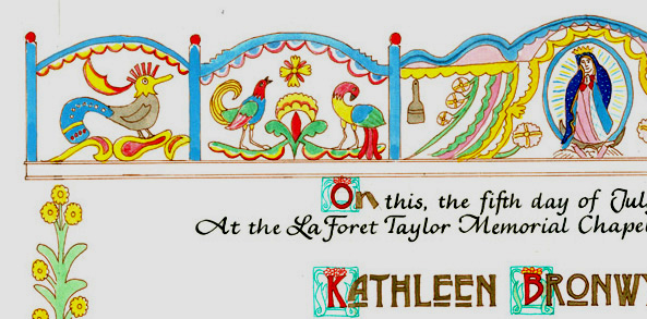
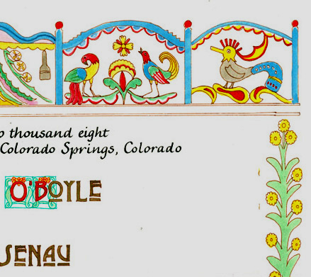
 Here is the finished
certificate with a picture depicting the decoration across the
top and showing the plant motif from the chapel, down each side.
The couple liked the style of the lettering in the Craftsman
certificates for their names, and the rest of the text is the
Palomares hand.
Below are some close
ups.
Here is the finished
certificate with a picture depicting the decoration across the
top and showing the plant motif from the chapel, down each side.
The couple liked the style of the lettering in the Craftsman
certificates for their names, and the rest of the text is the
Palomares hand.
Below are some close
ups.
 |
|
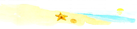
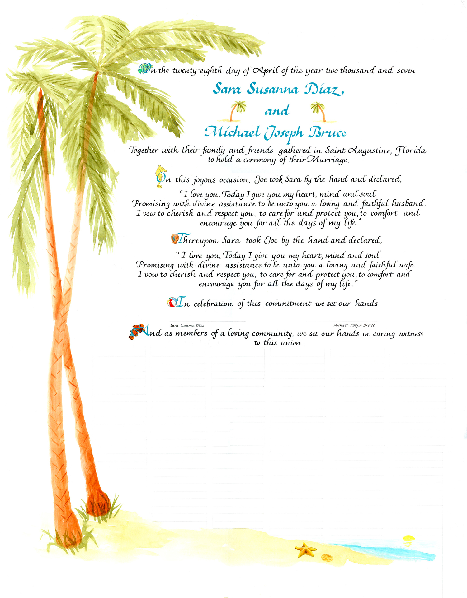 Sara and Michael wanted
a certificate with palm trees on the left and beach-related things
in the initial letters. All the text is in the Palomares style.
The certificate is on the right and closeups of some of the initial
letters and the beach scene at the bottom are below.
Sara and Michael wanted
a certificate with palm trees on the left and beach-related things
in the initial letters. All the text is in the Palomares style.
The certificate is on the right and closeups of some of the initial
letters and the beach scene at the bottom are below.


 |
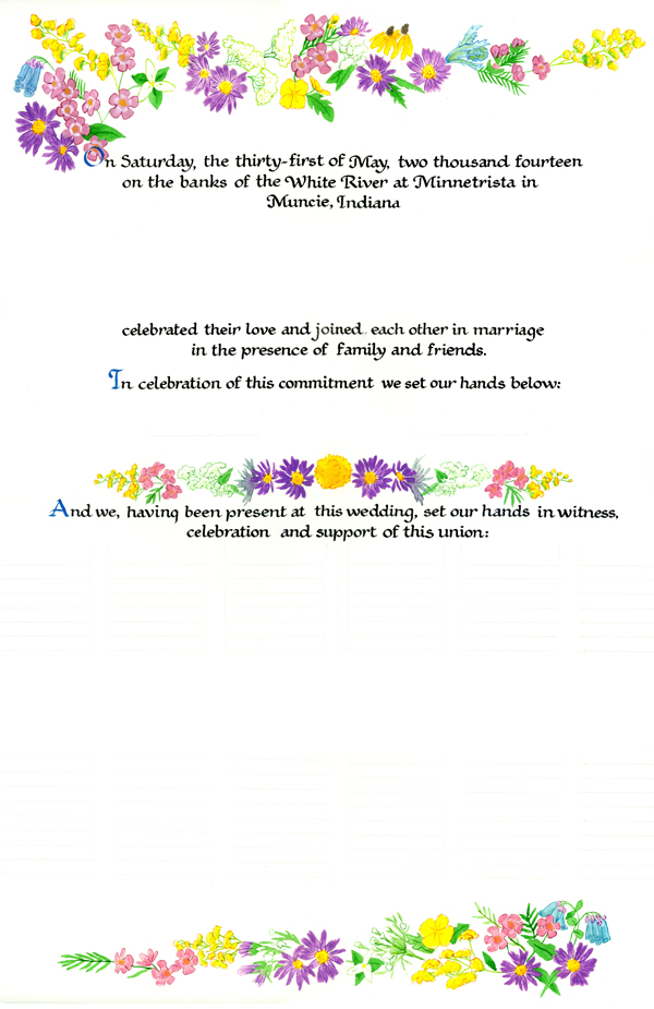 This couple wanted Indiana
wildflowers in an asymmetric design on top and bottom with a
symmetric spray in the middle. The calligraphy is Bookhand.
This couple wanted Indiana
wildflowers in an asymmetric design on top and bottom with a
symmetric spray in the middle. The calligraphy is Bookhand. |
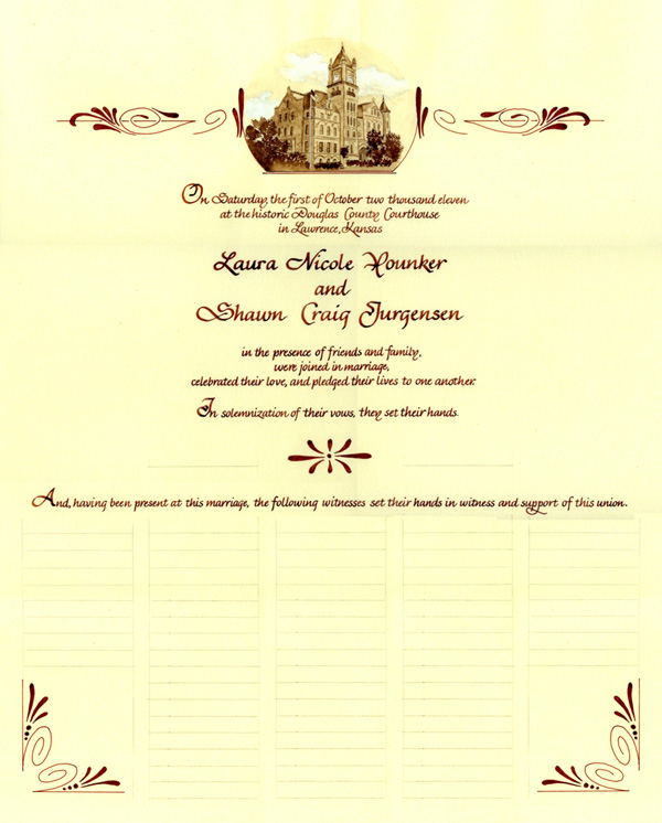 This certificate was ordered
by Laura and Shawn. They are both lawyers and work in the famous
courthouse shown in the painting located in Lawrence, Kansas.
They wanted the certificate to look like a poster from the old
west so all the lettering and decoration was done in brown. They
sent a modern photo of the courthouse and asked if I could delete
the "modern items" like traffic signals and light poles.
They liked the Vivaldi hand for their text.
This certificate was ordered
by Laura and Shawn. They are both lawyers and work in the famous
courthouse shown in the painting located in Lawrence, Kansas.
They wanted the certificate to look like a poster from the old
west so all the lettering and decoration was done in brown. They
sent a modern photo of the courthouse and asked if I could delete
the "modern items" like traffic signals and light poles.
They liked the Vivaldi hand for their text. |
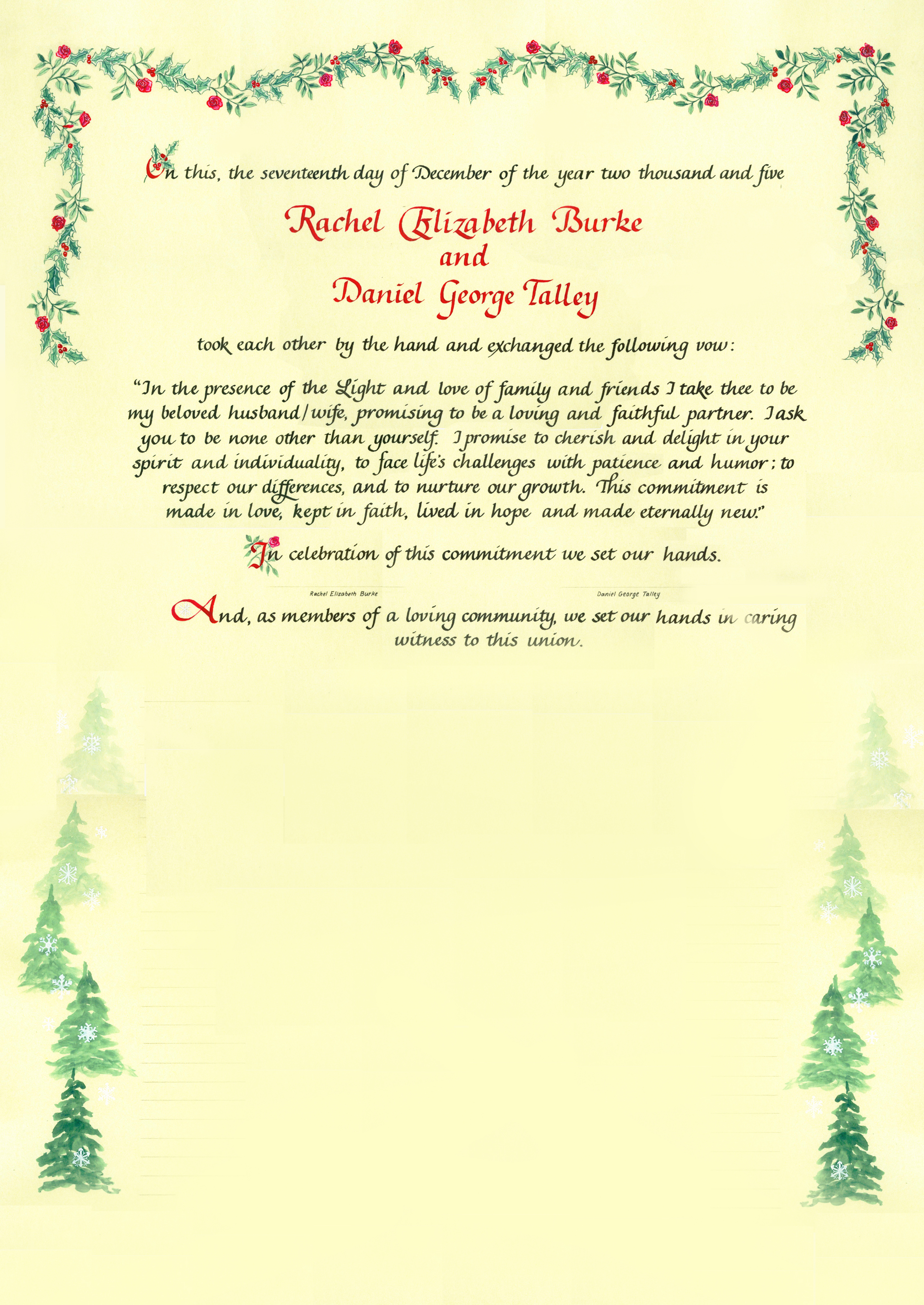
Rachel and Daniel
wanted a wintery, Christmas scene with red roses and variegated
holly. They also wanted a snow scene with pine trees going down
the sides of the signatures.
 |