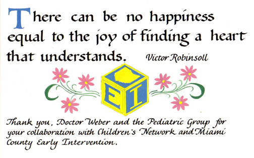
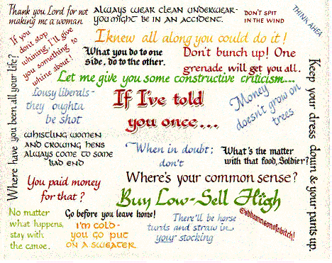
Every year the Children's
Network and Early Intervention group of Miami County, Ohio gives
an award to a local pediatrician. This is for outstanding service
to the 2 groups who seek out at-risk children and try to make
sure that they get the help that they need as soon as possible.
"At risk" refers to those children who, for a variety
of reasons may have a better than average chance of having a
disability. |
I did this piece
for a client whose husband recently got his graduate degree.
It is one of his favorite quotes. It is 11"x14". The
calligraphy is Palomares lettered on a watercolor painting.
|
This was a Christmas
present for a client's brother. It was 16"x20". It
was done on Bristol board with ink, watercolor and gouache. |
|
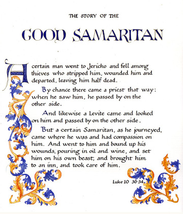
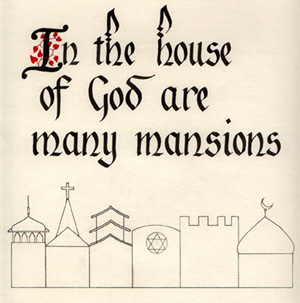
This is the story of
the Good Samaritan.
I lettered this for
all of the nurses in the intensive care unit at Good Samaritan
Hospital in Dayton, Ohio. Calligraphy is Bookhand with Gothic
decoration. |
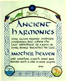
"Ancient
Harmonies" is done in a Quasi-Celtic style. The knotwork
and the larger text are in ultramarine or royal blue. The text
is in the uncial style and is in black ink. The decoration and
larger text are done in gouache and watercolor. |
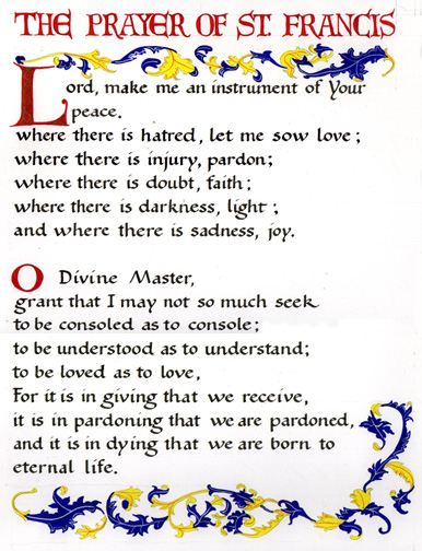
This is my interpretation
of Jesus's words. The lettering is Bastarde with some extra florishes
on the top. |
|
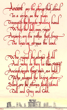
"Stonehenge"
was a piece that my husband did after a trip to England. It is
on white rag paper with red ink and watercolor. |
This is a piece that
I did for a client as a gift to her mother. It was done on white
Bristol board. The lettering style is Vivaldi. |
I did
this piece for my parents' fiftieth wedding anniversary. I had
heard these things all throughout my childhood, so this seemed
a good time to tell them that I really had been listening. If
you want one of these with your parents' sayings I will be glad
to do it for you. Please email us for the price. |
|

This is a piece that
I did for a couple's new home. Their last name began with a B.
You may order the same piece with your initial and your colors. |

This was a Christmas
gift for a client's boss. It was 11"x14". It was done
on cream colored linen finish paper with ink, water color and
gouache. The lettering style is Blackletter and the decoration
is a Gothic style. |
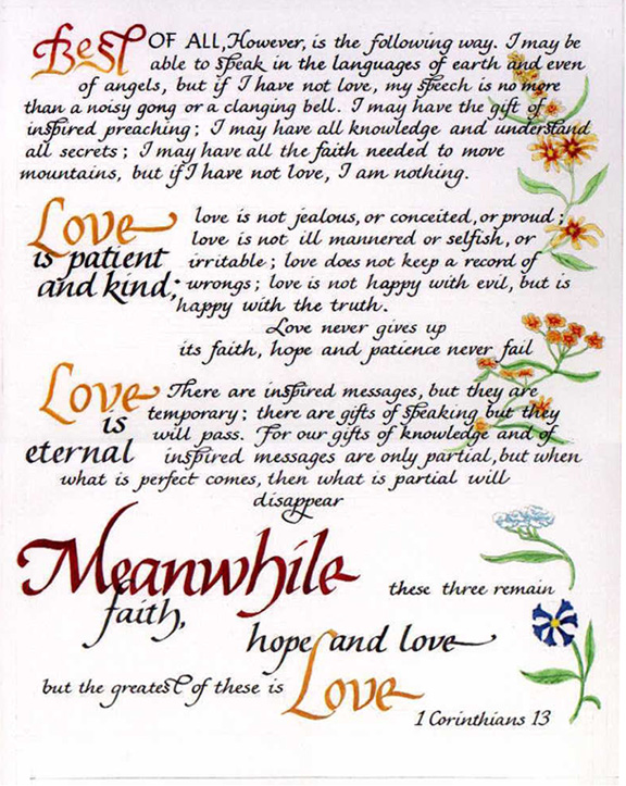
This was a piece
we did for a couple's wedding. It's another interpretation of
1st. Corinthians, 13. It was done on Bristol paper in black ink.
The alphabet is Palomares. It was done on 11"x 14"
paper. Of course all the other choices (colors, decoration, etc.)
would be yours. |
|
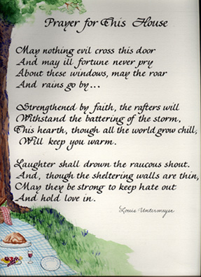
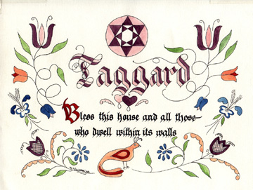
This is a piece that
I did for a couple's new home. He is an arborist and his wife
is a chef. His mother contacted me and asked me to work their
two professions into the decoration. That's why a house blessing
is decorated with a picnic under a tree. By the way, I am aware
that there is another verse to this poem, but this is what my
client wanted. |

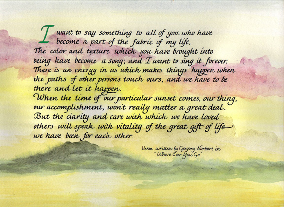
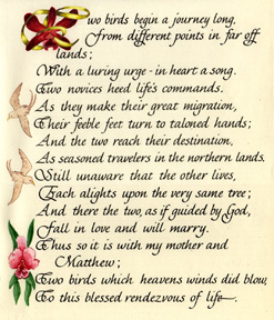
This poem was written
by my client. She asked me to letter it for her and decorate
it to match a room that she had redecorated. The pegasus came
from her website.The size is 16"x20". |
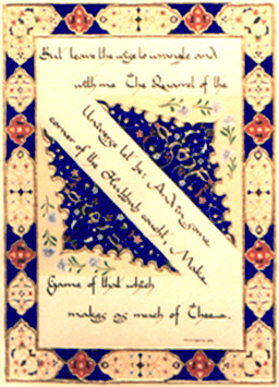
This is a piece I did
after seeing an exhibit of Islamic calligraphy. It was done on
white Bristol board in the Legend alphabet. The decoration consists
of tan and vermillion medallions on an ultramarine (royal) blue
background. It was gilded with 23k gold leaf on raised gesso.
It is currently in a private collection. It is framed 16"x20".
The words are: "But leave the wise to wrangle and with me,
the quarrel of the universe let be. And in some corner of the
Hubbub couch't, Make game of that which makes as much of Thee."
- Omar Khayyam |
|
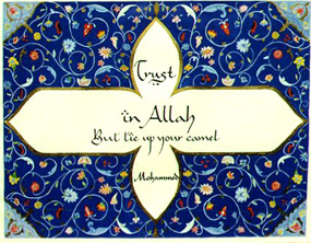
This piece is done in
an Islamic style. The background is meant to look like a Persian
rug. It is done on white paper with India ink, gold ink trim
and gouache and watercolor background. The blue of the background
is ultramarine (royal blue) and the calligraphy style is Legend. |
This is another commissioned
piece. It was done on white paper with black ink and blue and
green watercolor. It is 11"x14". |

This is a piece that
I did for my uncle who makes his own wine. It was done on tan
parchment with black ink. The alphabet is "blackletter".
The illumination is done in the style of the 15th century "Rohan
Master". I included this piece as an example of illumination
and lettering. |
|
This is a house blessing
done in Pennsylvania German or "Fraktur" style. It
is 11"x14". These are not traditional Fraktur colors,
which are usually red, blue, green and yellow. However the choice
of colors is up to you. |
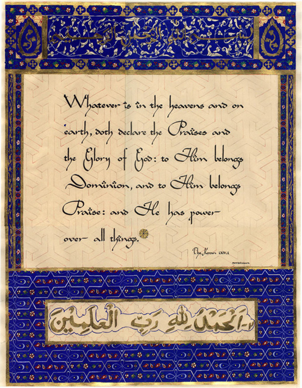
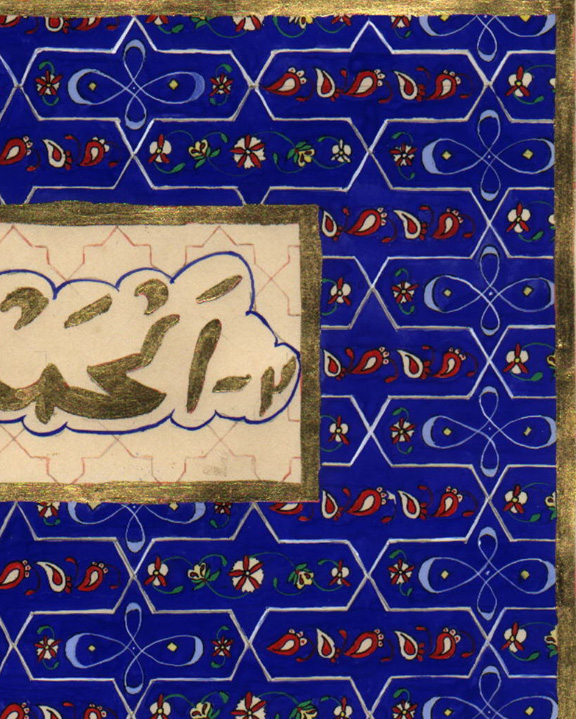
(Right) In the 15th. and
16th. centuries Moslem scribes produced some of the most spectacular
illuminated manuscripts ever seen. This is my humble attempt
to produce a page in that style. I used 100% rag paper, ink,
watercolor, gouache and 23K gold leaf. It represents about 100
hours of research and actual work. The writing in the top panel
is the "Bismallah" and means "In the name of God,
most gracious, most merciful". The writing in the bottom
panel is also in Arabic and says something to the effect of,
"Praise be to God, the cherisher and sustainer of the Universe."
The piece is 20"x30". If you would like to see a few
details from this, scroll on down. I did this many years ago
and am often asked if some of the design was already on the paper.
It was not. I started with a blank piece of paper. See below
for details. |
 |
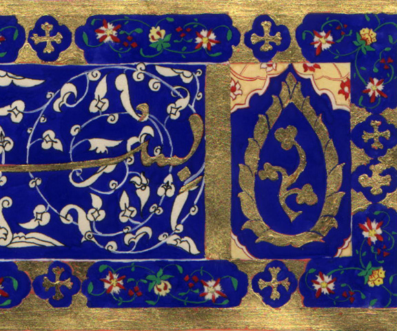 |
(Left) This is
a detail from the upper right corner. The area shown is approximately
3"x5"
(Right) This detail
is from the bottom right area of the page and is approximately
5" x 6" |
 |
|
|
Below are prints
of watercolor paintings we have available, Contact us for more
information. |
|
|
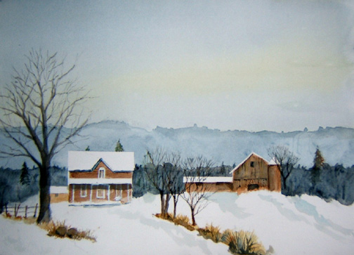
This is "Farm
in Winter" |
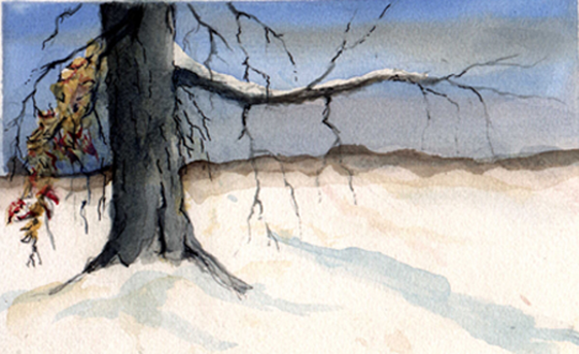
This is "Grandpa's
Tree" |
|